Science and art can work well together, especially through the actions of a talented artist like Lisa Roberts, who blends data with visual media to explore the living world.

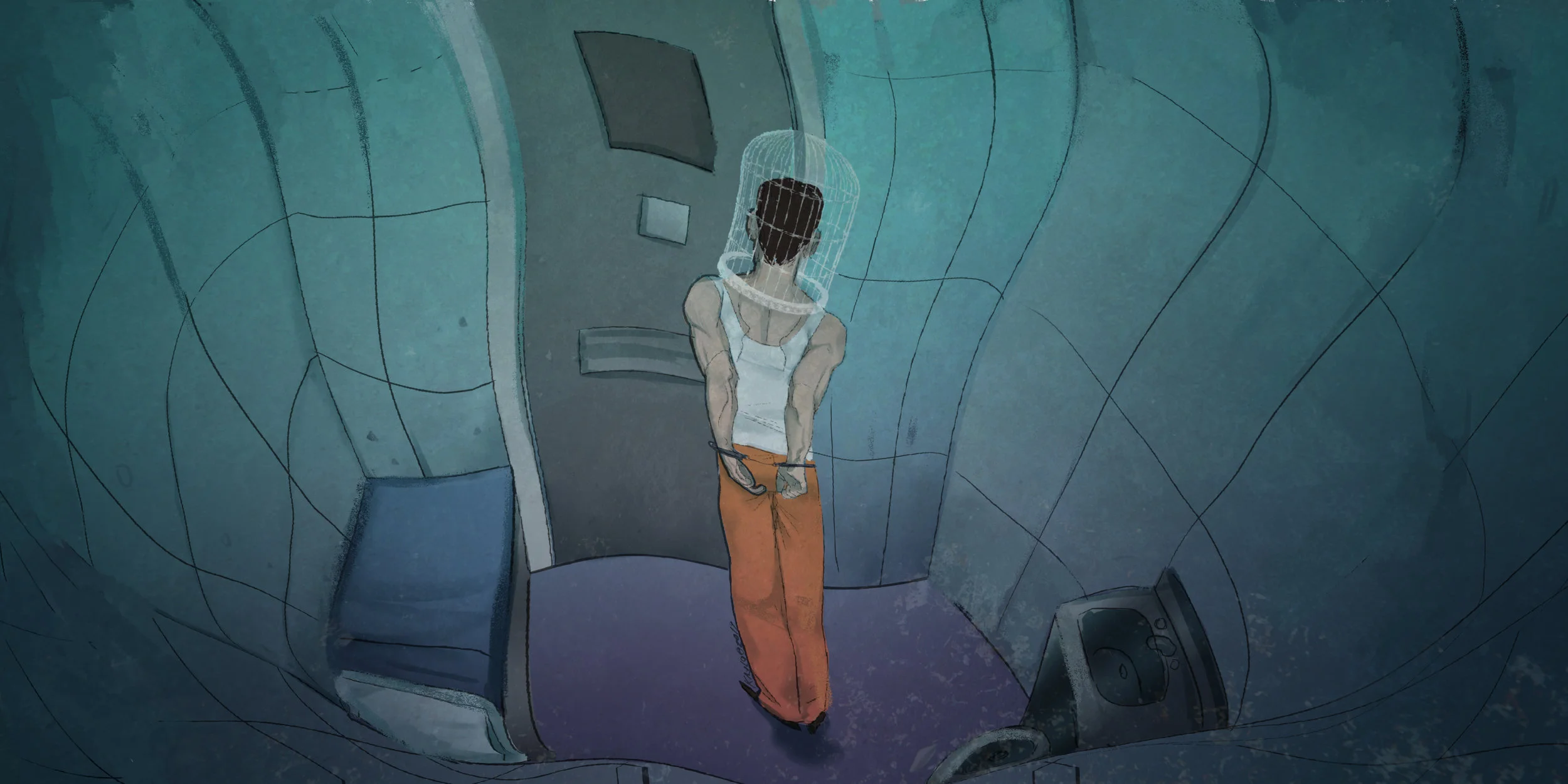
Illustration by Benjamin Dephoff
The results of collaborations between scientists and artists have been popping up in different forms, from art exhibitions, and science-related designer items to personal projects showcased online. In some cases a scientist will use an artistic medium such as animation or illustration to communicate a narrative; in others, artists themselves will express their own interpretation of a scientific concept.
Lisa Roberts is one such artist who blends scientific data with movement and animation. Lateral’s Art Director, Nicki Cranna, spoke to Roberts about how she combines art and scientific data in her recent work on the Living Data program. This program aims to help people understand science by engaging the senses in a clear and unexpected way.
Nicki Cranna: Tell us a little about yourself.
Lisa Roberts: I'm a visual artist and interactive author of Indigenous Australian and European ancestry. I'm also known as a data choreographer. I've always loved to dance and to draw the primal forms I've known since childhood, from Aboriginal artist Bill Onus, who was my mother's friend, and from German expressionist dancer Ceclia Waldman, who was friends with my father.
Since working in Antarctica, my life is full of scientists and other artists who inspire my curiosity and intuition to play with these same forms, to combine what we know through art and science. I lead the Living Data program to find out how scientists and artists can expand each others' understanding. I'm a Visiting Fellow at the University of Technology Sydney (Science) and Visiting Scientist (aka Artist) at the Australian Antarctic Division (Krill Biology).
Lisa Robert’s Phytoplankton Dance animation, 2014
Can you explain how the Living Data program works? What are you hoping viewers will take away from it?
Living Data is a hub within a growing global network of scientists and artists who share knowledge of our changing natural world. Living Data brings together scientists and artists to share data, iconography and stories, through recorded conversations, presentations and publications. Our interactions reflect Indigenous, biological and mechanistic perspectives of the reality that parts within the living world relate to, evolve and form whole systems, and that we are part of that evolving process.
Guided by Wilson (2008), I recognise the story as part of the relationships between us and the natural world. My hope is that more people recognise the iconography we share as expressing their own primal knowledge of relationships, and that this leads to understanding the universal language of science. I hope that more people enjoy this process of understanding and that it empowers them to explore new ways of relating, thinking and doing.
These pieces are best explained in practice. Could you walk the reader through a couple of your favourites, explaining in a simple way where the research data came from and what the artwork is doing with them?
The Oceanic Living Data installation is the major work of Living Data. Like a scientific model, it evolves to reflect new knowledge shared. Unlike a scientific model, you can move through it and feel part of it. It's a moving picture story projected through mesh retrieved from Continuous Plankton Recorder research. Mesh captures animated projections of traced data, including satellite data of Antarctic sea ice melting and forming, of microscopic data of phytoplankton forms and direct observations of Antarctic krill.
Each time the installation is presented, iconography and words are revised to make the story clearer and more integrated. Validation of the accuracy of this work, its clear language and sensory appeal, is representation in international events including Sydney Science Festivals, Sentinel Science and Antarctic Treaty Consultative Meetings (Hobart), Sur Polar art and science festivals (Buenos Aires), and most recently, the 2015 Climate Festival (Melbourne).
Lisa Robert’s Oceanic Living Data animation screened to 2012 Antarctic Treaty Consultative Meeting (ATCM) delegates at the Commission for the Conservation of Antarctic Marine Living Resources (CCAMLR) in Hobart.
Art and science are being combined in interesting ways these days. What's the relationship like between artwork and data when the boundaries between the two fields fall away?
Boundaries between science and art appear to me more in theoretical texts and hearsay than my experience. Since working closely with scientists and other artists I am wary of stereotyping, observing that many scientists are also artists and many artists apply scientific methods to their work. I recognise similar capacities in each of us that are required in both practices. As we cope with ever-changing workplace conditions we vacillate, to varying degrees, within a spectrum between mechanistic and sensorial, focussed and open, risk-averse and risk-taking, driven by personal aspirations and driven to make the world a better place. We are each observant and creative in different ways as we test theories, materials and technologies to disprove and validate feelings.
What are the advantages of using movement and animation to communicate scientific ideas?
Elemental trace forms of gestures can communicate a sense of balance between extreme physical and psychological conditions that can be measured and felt. These forms align with Indigenous knowledge and the Gaia world view, of Earth as a living whole of which we are a part. A sense of balance can allow for considered decisions to be made about how we relate to our environment.
What's on the horizon for the Living Data program?
2016 will see a turning point for Living Data as closer international connections expand our reach. Our new artist-in-residency initiative at the University of Technology Sydney begins with US-based photographer and curator Graham Howe. My collaboration with scientist and artist William Gladstone will contribute to the Ku-ring-gai Ph art-science project where ten scientists and ten artists collaborate to produce exhibits in 2016 for Eramboo artist environment and the Manly Art Gallery and Museum. Track Changes research will contribute to the 2018 Southern Ocean Knowledge and Information conference in Hobart, where science presented will contribute to the IPCC report on the health of the world's oceans. A new iteration of the Oceanic Living Data installation will provide artistic perspectives to the conference, including new works by Queensland-based artist Keith Armstrong that relate marine science to life on land. As new projects develop, more intimate events like our Walk Through Living Data will be staged to further engage local and international audiences.
Your work explores the effects of climate change on life beneath the ocean. If you could share one piece of information you've discovered in your research, what would you choose?
My animation, Krill Sex, contributes to understanding how, when and where Euphausia superba (Antarctic krill) have sex. Knowing that krill have sex on the seafloor of Antarctica is vital information for policy makers and the public to understand, in order to ensure conservation of this habitat for future generations.
Lisa Roberts, Krill Sex, 2010
Thanks for speaking with us, Lisa Roberts.
Edited by Jessica Herrington and Sara Nyhuis